Subscribe in a reader
All images are Copyright Protected and the property of Jamie Williams Grossman. Paintings and photos displayed on this site may not be reprinted, copied, downloaded, displayed elsewhere, or used for any reason without her written permission.
Subscribe in a reader
All images are Copyright Protected and the property of Jamie Williams Grossman. Paintings and photos displayed on this site may not be reprinted, copied, downloaded, displayed elsewhere, or used for any reason without her written permission.
-------------------------------------
CUSTOMER REVIEWS
"OMGGGGG, Jamie!!!! It's absolutely amazinggggggg!!!!!! I loveeeeee it!!!!!! This is sooo much more than I could have imagined!!! Thank you!!!!"
"It's spectacular, Jamie!!! How talented you are! We absolutely love it! And you are right-the frame is just perfect for it! "
"Happy" with it is an understatement! My sister's husband said, "Wow, it's beautiful!" That's a lot of emotion coming from him! haha. And my adult daughter said, "OMG MOM, ITS GORGEOUS!". You have added to your fan club!
"Jamie, your painting arrived in perfect condition! And, as I expected, it looks even better ‘in person’ than on the computer screen. Thank you so much for your careful packing and wonderful painting."
"...Today I finally surprised [my wife] with the actual painting! It is her birthday! And I just wanted to let you know the we both absolutely love it!! She was so so surprised, and just speechless.... Thank you again for being so flexible and good to work with! It was such a joy preparing for today and I appreciated your professionalism throughout the process!"
"I love the new painting! It's actually a little more golden and fluid than it looks in the pic and I love the movement; everything in my house is a little on the warm and yellow and gold side so it could hang pretty much anywhere. It's going to the framer shortly and I look forward to having it up :-)"
"Jamie, it's lovely!!! Thank you so much for all the time and love you've put into it! You have no idea how much joy your work is bringing to me. I'm very grateful!"
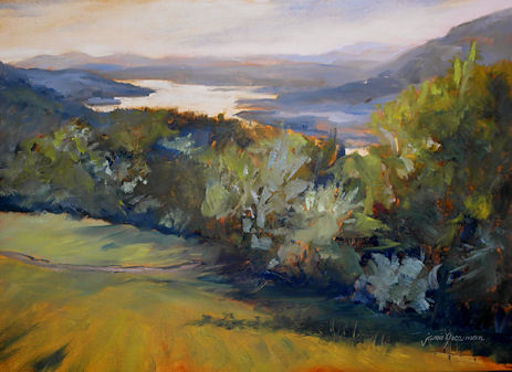
"I just wanted to share that my father-in-law absolutely LOVES your painting. He loves the frame and said that he's never owned a real oil painting. ???? But most importantly, he loves the subject matter and he and my husband spent a lot of time reminiscing this morning about hikes they took there years ago. This part of the Hudson is, by far, their favorite! Thank you SO much for making this Christmas gift PERFECT."
"Your paintings of my beloved Hudson Valley are stunning! I've always loved Hudson River paintings, and can't believe that I've found someone who is following in the great tradition of Cropsey and company! "
"We received your painting yesterday and it's really very beautiful. Thank you again very much."
"Your beautiful "Autumn at Rockwood" arrived in perfect condition two days ago. It is even more lovely in person than I ever could have imagined. Thank you so much for your artistry and your many kindnesses to me..... I will treasure both of my paintings very much ..."
"I'm more than happy, I'm thrilled!"
"I just wanted to let you know that I received [the painting] today! It is beautiful, thank you so much:)"
"Your [miniature] Caillebotte arrived today. Wow, it's WAY better seeing it in person
than viewing an image/photo of it. Spectacular.....
Thank you so much!!"
"It's beautiful. Thank you so much!"
"Oh, Jamie! It is fabulous!!!!!!! I love it!"
"Hi Jamie, I received painting yesterday. It's really beautiful! Thank you for sending so quickly. I'm sure it will give my friend hope and strengthen as she faces this battle with Parkinson's. Thank you!"
"Jamie,
My painting arrived Thursday and I love it. I will definitely order from you again."
"[They] love the painting. They were so surprised. They really appreciate it and the thought and artistry behind it. They received many [wedding] gifts, and said this was one of their two favorites."
"[My husband] loved loved loved the painting! It is hanging on the wall in my great room. It's just beautiful!"
"Hi Jamie! The beautiful paintings arrived safe and sound this afternoon. I love them! (Boy you don't mess around with packing them ;) Thank you."
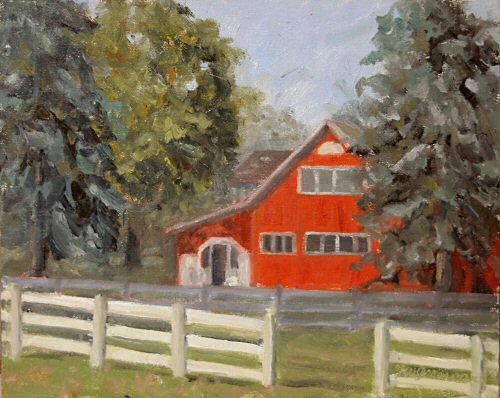
"Hi Jamie –I thought you’d enjoy seeing “The Red Barge” framed. Until I give it to my husband on his birthday, I have it hanging in my office. I LOVE looking at it all day!"
"I received the painting this morning. It is SO FANTASTIC!!!!!! I wish I would have had it done larger. Thank you! thank you!"
"The East from Hunter Mountain painting arrived the other day.
It made it through the snow and looks great. Thanks for everything."
"Jamie, my wife and I love it. Thank you and great work. It was difficult trying to figure out a special gift for them......I'm very happy that I reached out to you. I know they will love the painting and the special touch you did with the card! "
"Wow, it looks AMAZING! They are going to love it. I love the name too. Perfect. ... Thanks again!"
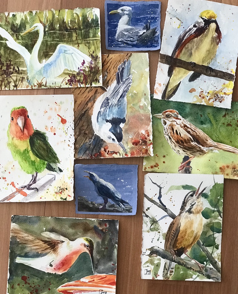
"Your lovely painting of a sweet bird, framed beautifully, arrived last week.... I just adore it!!... I see it and injoy its beauty every day! Thank you so much!"
"The painting is beautiful! I love it! "
"Just a quick note to let you know your [miniature] Monet arrived in perfect condition. It looks fabulous!!! Thank you again so much."
------------------------------------------
If you haven't seen the two-DVD set, "The Impressionists", you don't know what you're missing!
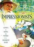
I rented it from Netflix and absolutely loved it. It is an enactment of the lives of Monet, Renoir, Manet, Cezanne, Degas, and other Impressionist painters living at that time around Paris. Fascinating and eye-opening!